
How to Choose Wedding Colors.
One of the first things to do when planning your wedding is picking wedding colors that will help set the tone for your celebration and tie together all the details. Your wedding colors can be expressed in your stationery (save the dates, wedding invitations, day-of accessories), the flower arrangements, table linens, and the wedding party’s attire. Our best advice on how to pick wedding colors: Start with your favorite hues and then balance them with accent colors that will complement the season and your wedding venue.
We’ve put together some of our favorite wedding color ideas and summarized emerging wedding trends to get you started.
Classic Color Combinations.
Some looks never go out of style, and these classic wedding color schemes are absolutely timeless. Make them your own with personal touches, from your choice of flowers to decor accents.
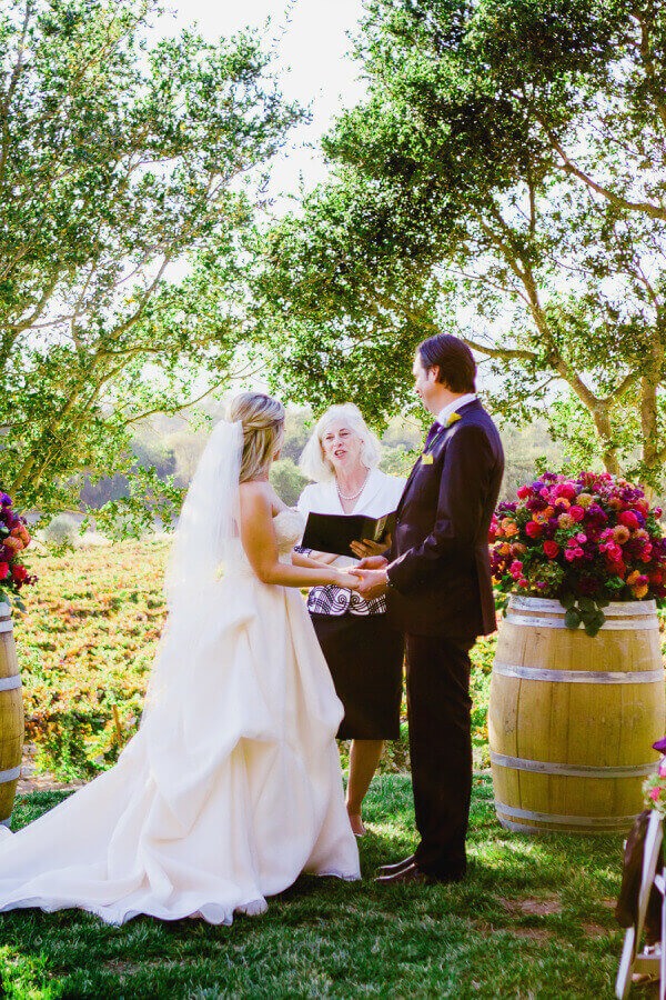
Ivory + Sage
Good for: spring weddings
Ideal venues: garden, vineyard, loft
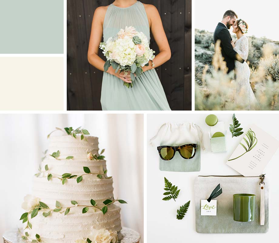
These beautiful wedding colors are timeless yet always feel fresh. Create an elevated, formal look by adding gold accents, or go wild with greenery if your style is more boho and organic. Pair these soft hues with warm, romantic candlelight.
Shop Green invitations | Shop White invitations
Photos: Ashley Caroline Photography (dress), Jessica Casperson Photography (couple), Minted (moss-colored favors), Bryce Covey Photography (cake). Invitation: palmetto by kelli hall.
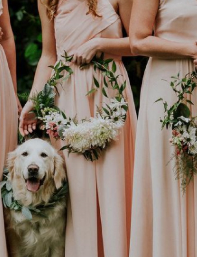
Blush + Burgundy
Good for: fall or winter weddings
Ideal venues: winery, farmhouse, historic estate
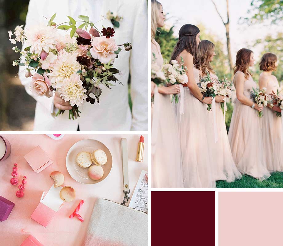
It’s no wonder blush and burgundy—the colors of wine and roses—make an utterly romantic wedding color palette. Choose florals like dahlias or garden roses in soft blush tones, then add a few burgundy-hued blooms for a touch of drama.
Shop Pink invitations | Shop Red invitations
Photos: Jillian Mitchell Photography (bouquet), Cassidy Carson Photography (bridesmaids), Minted (rose-colored favors).
Navy + Silver
Good for: formal summer weddings
Ideal venues: yacht club, Sperry tent on a lawn, country club

These clean, crisp colors evoke a preppy, East Coast vibe with some subtle nautical overtones. You could fully embrace the nautical look and decorate the reception with classic sailor stripes, or amp up the silver tones to steer your navy color scheme in a more regal direction.
Shop Blue invitations | Shop Silver invitations
Photos: Bryce Covey Photography (suit), Rebecca Yale Photography (shoes), Candice Benjamin Photography (bouquet).
Black + White
Good for: any time of year
Ideal venues: hotel ballroom, loft, art gallery

It doesn’t get more classic than black and white. Set the tone for a formal invitation with a sophisticated black-and-white invitation; ask your bridesmaids to wear their favorite all-black cocktail gown for a look that’s chic and perfectly coordinated, but not overly matchy-matchy.
Shop Black & White invitations
Photos: Apryl Ann Photography (cake), Jose Villa (bridesmaids). Invitation: Ribbon Border by Jill Means.
Peach + Gray
Good for: spring and summer weddings
Ideal venues: historic estate, modern farmhouse, art gallery

A versatile color combination, peach and gray can easily skew sleek and modern or sweet and romantic. Add marble accents (i.e., a marble cake stand or marble-patterned stationery) to take the colors in a modern direction, or play up the peach if your wedding style is more casual and laid back.
Shop Pink invitations | Shop Silver/Gray invitations
Photos: Joel Bedford Photography (bridesmaids), O’Malley Photographers (cocktails). Invitation: Boho Chic by Kristie Kern.
Trending Now.
Create a stylish wedding look with a color combination that’s current, modern, and uniquely you. Here are some of the top, on-trend wedding color palettes we’re seeing right now.
Shades of Purple
Good for: spring and summer weddings
Ideal venues: park, garden, winery, loft

This perennially popular wedding color will bring a vibrant energy to your celebration. Start with a medium-tone shade like violet, then accent it with lighter hues like lavender and lilac; or go bold by pairing it with deeper purple shades like plum and wine.
Photos: Rachael Schirano Photography (shoes), Christian Oth Studio (bouquet), Elizabeth Messina Photography (bridesmaids). Invitation: Foliage Wreath by Grace Kreinbrink.
Greenery
Good for: spring and summer weddings
Ideal venues: any space

The greenery trend is here to stay. Wedding invitations featuring botanical motifs, verdant vines, and lush garlands create a wedding look that’s elegant, fresh, and full of life.
Photos: Mint Photography (venue), Jen Huang (boutonnieres), Julie Cate Photography (cake). Invitation: Fresh Fern by Kristie Kern.
Peacock Blue + Papaya + Sand
Good for: summer and fall weddings
Ideal venues: loft, barn, beach

Colors this bold can overwhelm easily, so it's a good idea to mix in a sophisticated neutral like sand. Together, the trio of colors has a clean, modern elegance that’s perfect for outdoor settings and blank-space venues.
Photos: Clayton Austin (bridesmaid), Charla Storey Photography (flatware), Matthew Moore Photography (reception).
Dusty Rose + Taupe + Ivory
Good for: spring and winter weddings
Ideal venues: historic estate, garden, country club

Pink is a perennially popular wedding color but these days, couples are gravitating towards a more muted shade of dusty rose. Pair it with soft neutrals and add textural fabrics (like lace and chiffon) and metallic accents for depth and visual interest.
Shop Dusty Rose wedding stationery
Photos: Heather Payne Photography (bouquet), Branco Prata Studio (shoes), Brooke Images (car). Invitation: A Thousand Years by Design Lotus.
Gradient Monochrome
Good for: any time of year
Ideal venues: any space

What goes with any wedding color? More of that color! Picture an ombre cake and your wedding party dressed in pretty shades in the same color family; add depth with tonal fabrics and floral arrangements, and finish the look off with dip-dyed favor boxes and table decor.
Photos: Michelle Lange Photography (bridesmaids), Maggie Austin Cake (cake), Minted (merlot-colored favors).
Fresh & Unexpected.
Make your wedding stand out with a unique color palette your guests haven’t seen before. These imaginative pairings will create an original look that’s fresh, unexpected, and totally you.
Rust + Taupe
Good for: late summer and fall weddings
Ideal venues: desert settings, farmhouse, barn

This taupe and rust wedding color palette was made for the warm light of late summer and fall, inspired by the rich hues of sunset-colored mountainscapes. Accent these unique colors with warm copper or gold tones for a bit of shimmer.
Photos: Jordan Voth Photography (couple), A Fabulous Fete (tiles), Half Acre House (cake). Invitation: Ethereal Wash by Everett Paper Goods.
Mustard + Slate Gray
Good for: any time of year
Ideal venues: loft, city hall, museum, barn

This versatile color scheme works for every season: amp up the gray tones to make it more appropriate for winter or spring, or take the yellow up a notch for fall or summer celebrations. Also, since these shades are neither overtly feminine or masculine, they’re perfect for couples looking for gender-neutral wedding color combinations.
Photos: Ashley Largesse (suit), Henry + Mac Photo Co. (table), Minted (warm gray tote bag). Invitation: Sprinkled Love by Paper Dahlia.
Citrus
Good for: summer weddings
Ideal venues: backyard, garden, country club, beach

Whether you’re planning a destination wedding on the beach or an alfresco backyard bash, a citrus-inspired color palette will bring a bright burst of flavor to your wedding look. Bring it to life with zingy cocktails, vibrant flowers, and actual citrus fruits in your table centerpieces.
Photos: Whitney Heard Photography (bouquet), Jen Huang (drinks), Minted (lemon-colored favors). Invitation: Tropical Border by Baumbirdy.
Black + White + Pop of Color
Good for: any time of year
Ideal venues: ballroom, historic estate, museum

Black and white is a classic combination, but you can make it your own by adding a bright pop of color. Look for accent-color inspiration in seasonal flowers and menu ingredients, the setting for your event, or simply choose a color that’s meaningful to you.
Photos: Shannon Moffit Photography (suit), Sophie Kaye Photography (shoes), Judy Pak (cake). Invitation: Letters by JoAnn Jinks.
Jewel Tones
Good for: fall and winter weddings
Ideal venues: winery, ballroom, conservatory

Don’t be afraid to use darker hues in your wedding color scheme - a palette with deep jewel tones can create a mysterious, romantic mood or a rich, regal ambience. Illuminate the look with lots of candlelight or warm evening sunlight.
Photos: Clary Pfeiffer (bridesmaid), Kelli + Daniel Taylor Photography (ring), Charla Storey Photography (lounge).
WEDDING COLORS AND THEIR MEANING
When creating a theme or look for your wedding, remember to let your colors reflect who you and your partner are. Also keep in mind the decor of your venues for the ceremony and reception to make sure your colors coordinate with the surroundings. Take inspiration from the season and which flowers, greenery, and produce will be available that time of year.
For a more customized approach to your wedding colors, take a closer look at each color’s meaning, pairing ideas, and inspiration for incorporating them into your event.
- White is a traditional wedding staple, signifying light and purity. White ranges from warm ivory to cool bluish shades, so you can use it as the base of any wedding color combination. Popular white flower choices include roses, anemones, lily of the valley, ranunculus, peonies, and dahlias.
- Pink signifies sweetness and love. Pair with aqua for a fun, retro vibe, or deep burgundy for a romantic look. Deck out your bouquet and tablescapes with lilies, sweet peas, ranunculuses, peonies, and cherry blossoms in your favorite rosy shades.
- Red represents passion and romance. It’s a classic choice for weddings and its various shades look good on just about everyone. Use it as your sole accent color, or combine it with blush, tangerine, or other jewel tones. Add a pop of crimson with anemones, tulips, and roses (of course), or try protea or amaranthus for something unexpected.
- Orange conveys energy and creativity. Create a playful palette with yellow and pink, or fall for deeper shades with garnet and purple. Infuse a splash of orange into your celebration with marigolds, birds of paradise, poppies, and yes, oranges.
- Yellow evokes sunshine and joy. Pairing yellow with cornflower blue creates a country-inspired look, garnet brings depth and drama, and gray creates a cool modern feel. Brighten up a bouquet with daisies, daffodils, craspedia, and sunflowers. Citrus fruits are also a fresh way to bring a fun, cheerful vibe to your displays.
- Green symbolizes growth and renewal. Sage, gold, and ivory are a classic wedding color combination, while peach and wine create bohemian color pairings. Bring in some greenery to your bouquet with eucalyptus, succulents, palm leaves, ferns, and even air plants. You can also complement your decor with garlands of olive or eucalpytus.
- Blue is a calming color that represents water and sky. Pale blue and elegant navy pair perfectly with blush, gold, and burgundy, while brighter blues go well with greens and buttercup yellow. Iris, hydrangea, tweedia, cornflowers, thistles, muscari, and forget-me-nots will add a burst of blue to your bouquet.
- Purple is associated with royalty and luxury. Gold and jewel tones add opulence to royal purple, sage creates an earthy look, and orange and burgundy complete a vibrant, saturated palette. Play with shades of purple in your floral arrangements with lavender, orchids, thistle, lilac, hydrangea, and wisteria.
- Black has an elegant, formal presence that can anchor your wedding color scheme. When used sparingly as an accent or background color, it can add drama and make your other hues pop.
- Metallics as accent colors give your wedding color theme instant glamour with a luxurious finish. Gold symbolizes light and prosperity, silver is modern and sophisticated, and rose gold is warm and elegant. Make your wedding sparkle with foil-pressed stationery, metallic table settings, and high-shine accessories.
More on Color.
Spring Colors
Spring is the season of renewal. With flowers blooming and fresh colors popping up, it’s an inspiring time… Read More ▶︎
Summer Colors
Vibrant colors make a splash at summer weddings. The sunny season’s gorgeous weather and brightly hued flowers… Read More ▶︎
Fall Colors
Fall is the season for warm, saturated colors. Get inspired by the changing coliage and autumn harvest… Read More ▶︎
Winter Colors
Imagining yourself walking (down the aisle) in a winter wonderland? Winter is a magical time of year for a… Read More ▶︎